How to Ensure Accurate Data Representation
This is some text inside of a div block.
Design Tips
How to Ensure Accurate Data Representation


To ensure accurate data representation, it’s important to maintain the integrity of the graph. Here are some examples of challenges you’ll want to take into consideration.
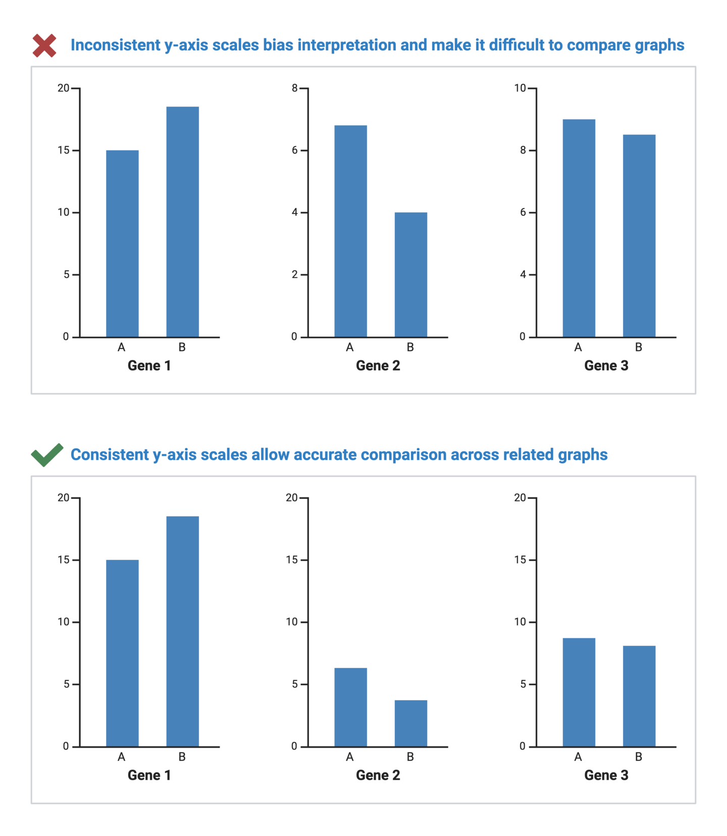
Axis scales are fundamental to interpreting graphs as they provide a reference frame for understanding the magnitude and relationships within the dataset. A misleading axis scale can distort the true narrative of the data, whether intentionally or unintentionally. In scientific data visualization, maintaining data integrity is crucial to accurate storytelling.
Consider these tips for ensuring that your axis scales retain data integrity and accuracy:

BioRender Graph makes axis customization easy. Learn more today.
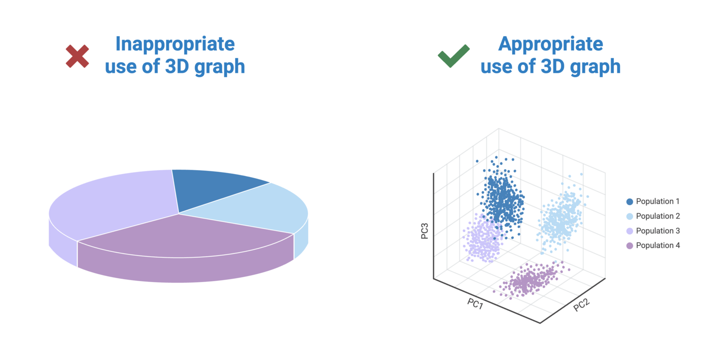
Visual perspective plays a significant role in how we perceive data in graphs. It involves the angle and distance from which the viewer sees the graph. One of the main culprits of data distortion is the use of 3D graphs. Unnecessarily adding 3-dimensionality to a graph causes data in the foreground to appear larger than data further in the background. This makes it nearly impossible for viewers to draw accurate comparisons between groups in a dataset.
Consider these tips for avoiding data distortions caused by inappropriate perspectives:
.png)
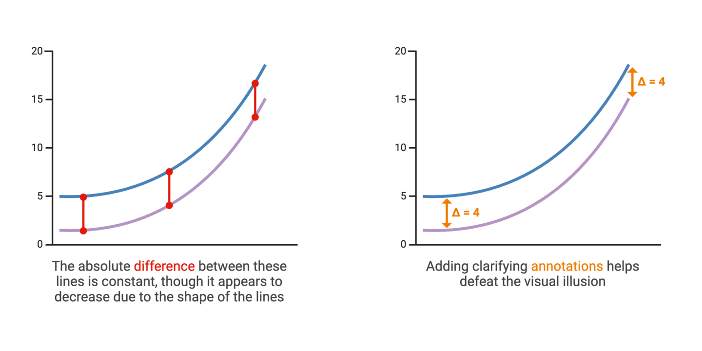
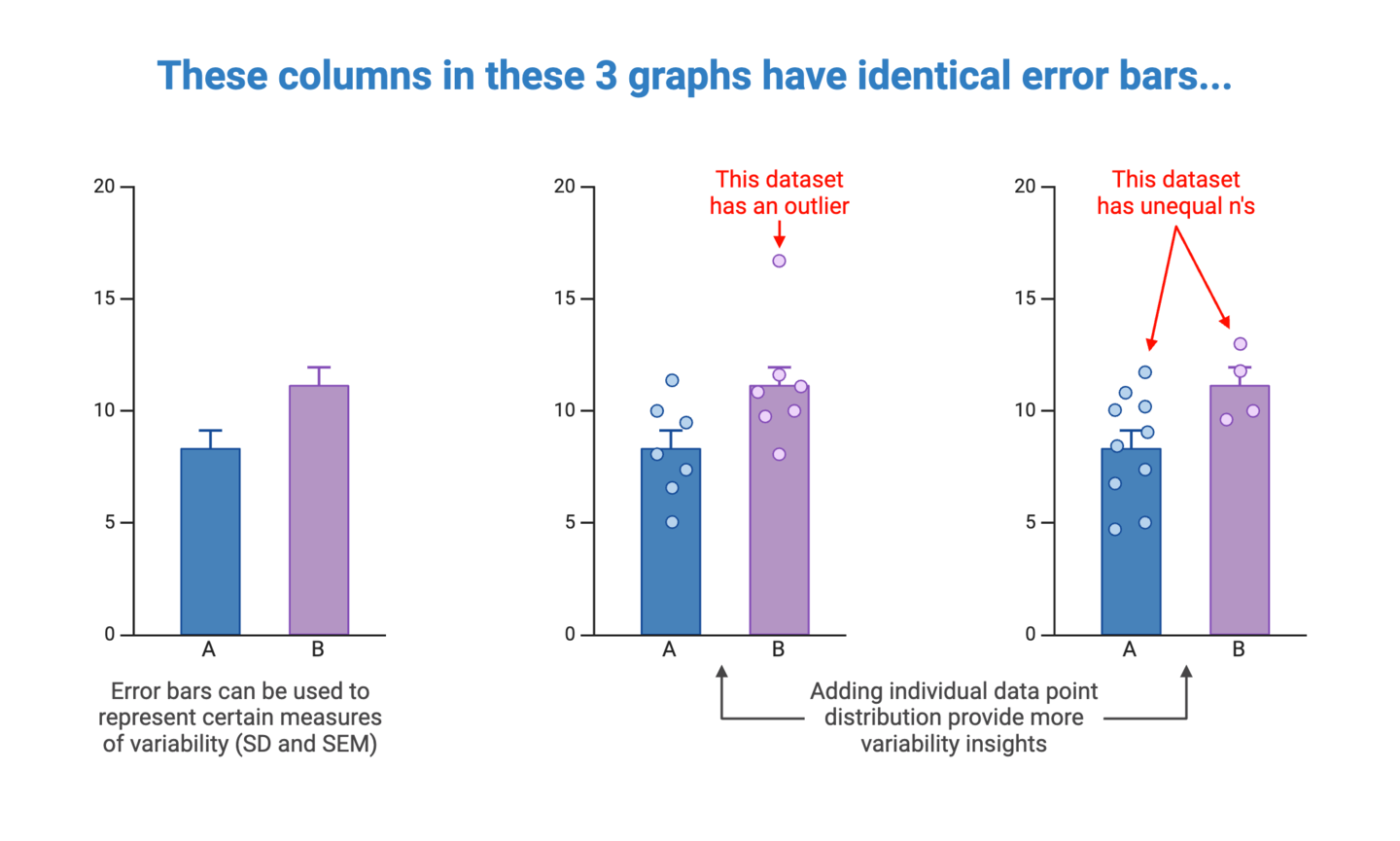
Communicating variability is an important aspect of accurate data visualization and statistics. In most scientific graphs, the primary comparison is between group averages. But averages don’t tell the whole story. Representing the degree to which individual data points in a dataset diverge from the average values provides insights into the spread and reliability of the data.
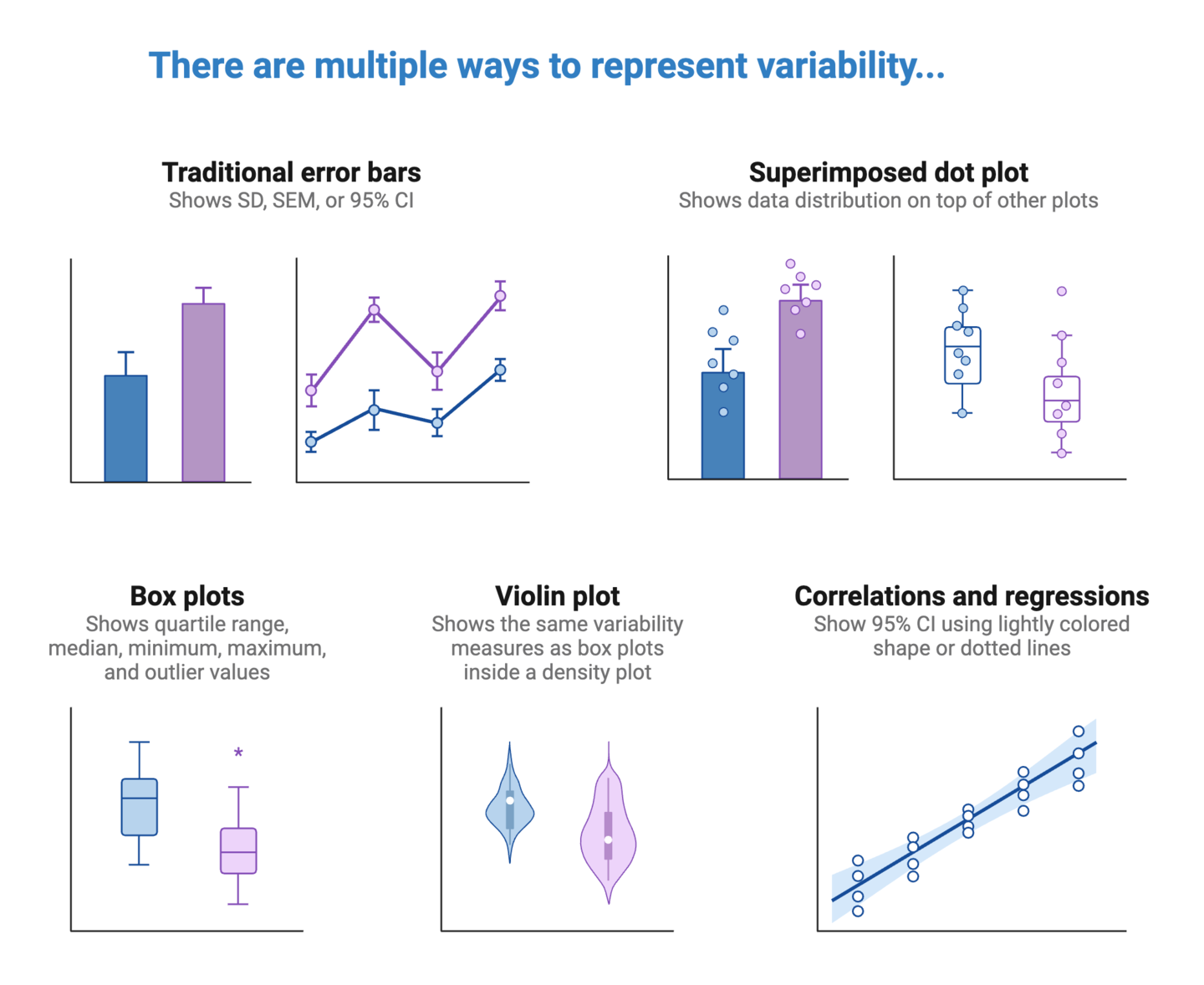
When deciding on how to represent variability in your graphs, you will first need to determine the most appropriate measure(s) of variability to include. This will depend on the type of data, as well as context surrounding the data. Detailed coverage of this topic is best left to statistical resources, but here are common options to consider:
Once you’ve determine what variability measures to include, you should consider how to represent them in your graph. This will again depend on the type of data and graph. As a best practice, try to select the simplest way of representing variability to ensure that this information is salient and clearly interpretable by the viewer.
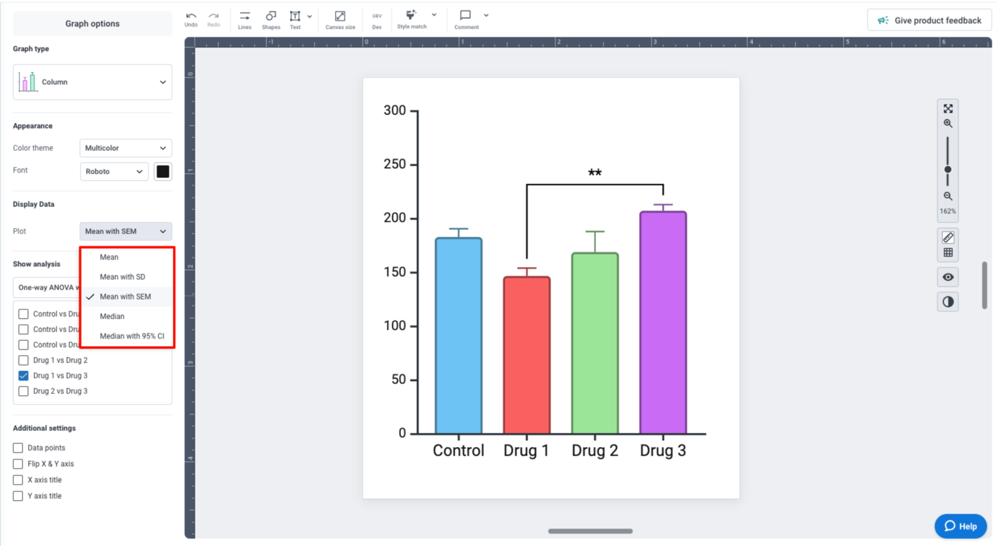
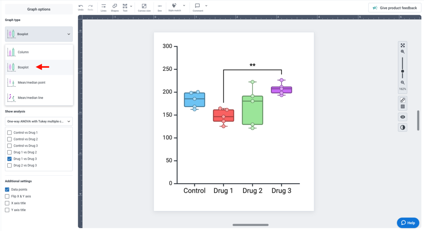
BioRender Graph gives you multiple options for representing data variability, depending on the type of graph you’re working with. For columns and points, the “Display Data” settings in the left panel allows you specify what your error bars should represent: mean with SD, mean with SEM, or median with 95% CI.
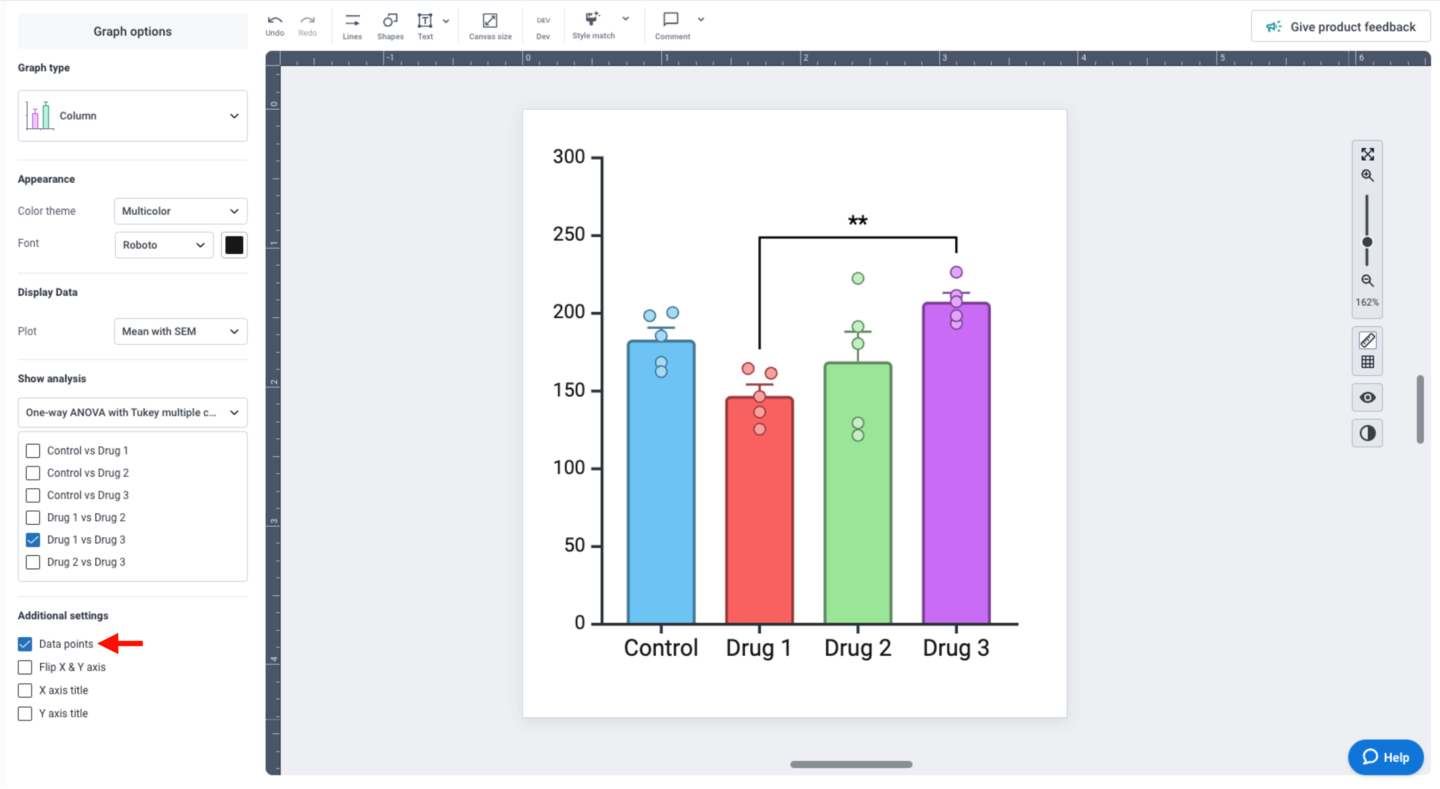
You can also superimpose individual data points to your graph by checking “Data points” under “Additional settings” in the left panel.
If your dataset is compatible with boxplots, you can also change the “Graph type” to “Boxplot”.
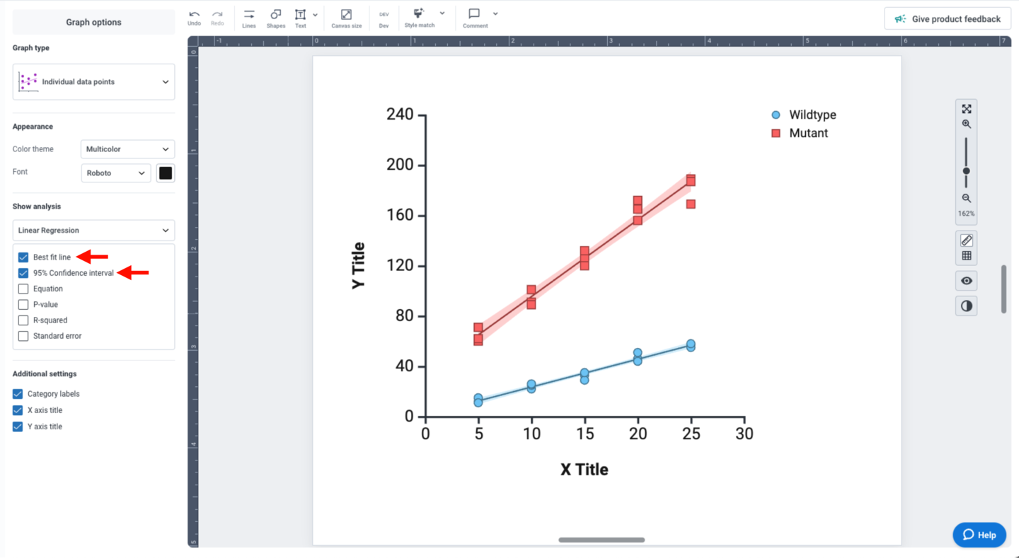
For linear regression analyses, the “Show analysis” panel provides multiple display options. Check the “Best fit line” and “95% Confidence interval” options to display variability in your dataset. The 95% CI is displayed as a light color-matched shape behind your data points.