Meet the PhD's and Medical Illustrators Who Hand-Build BioRender's 50,000+ Icons
This is some text inside of a div block.
Meet the PhD's and Medical Illustrators Who Hand-Build BioRender's 50,000+ Icons


Every BioRender icon and template is hand-built by trained medical illustrators and science designers with deep scientific expertise. Here's a behind-the-scenes look at the research, peer review, and continuous corrections that go into getting the science right.

Before an icon of an antibody ever reaches your figure, someone has had to decide how the heavy and light chains pair, where the hinge bends, whether to show the glycosylation, and which of several conflicting textbook depictions is actually correct. That requires a trained medical illustrator, and their refinements determine whether an icon clarifies the science or misleads, in thousands of papers, grants, and lecture slides at once. Fewer than a hundred people graduate from accredited medical illustration programs in North America each year, and BioRender has brought many of the best of them onto one team. Why invest in that when AI can generate an image in seconds? For the same reason no one writes a paper entirely with AI and submits it for publication: the science still has to be done, checked, and backed by people. AI is great for early exploration, which is why we've built it into BioRender. But the figure you publish needs an expert behind it.
Dragging that antibody onto your canvas takes a second. Getting it there takes weeks of research, drawing, and review. Here's a behind-the-scenes look at what goes into it.
Medical illustration is a formally accredited profession that sits at the intersection of science and art. In North America, only five graduate programs are accredited by the Commission on Accreditation of Allied Health Education Programs (CAAHEP), and each admits a small cohort, often between seven to twenty students a year.
In many of these programs, students train alongside medical students, taking gross anatomy and dissection in the same labs and observing surgeries firsthand. They study anatomy, cell biology, and physiology next to drawing and visual communication. That means a trained medical illustrator understands both what a structure is and how scientists need to see it. BioRender has assembled a team of these specialists and pointed their expertise at one goal: the largest accurate library of scientific icons in the world.
The BioRender team blends medical illustration with bench science, with many holding advanced degrees in the fields they draw for. Here are a few of them.
Shiz Aoki - Co-Founder & CEO. Trained in medical illustration at Johns Hopkins School of Medicine, one of the field's most selective programs, and the former youngest scientific illustrator at National Geographic. She ran a medical illustration studio before founding BioRender, after watching world-class scientists lose days wrestling with basic drawing tools.
Natalie Intven - Senior Medical Illustrator. Holds a Master of Science in Biomedical Communications from the University of Toronto and a BSc in Human Kinetics. She has illustrated thousands of textbook figures for educational publishing and created hundreds of icons in the BioRender library.
Michael Stanfel - Senior Technical Illustrator. Has over a decade of technical illustration experience, simplifying complex mechanical and scientific subject-matter into clear & communicative artwork. He oversees technical icons, now one of the most-requested types, so the same rigor extends to the instruments and equipment scientists work with.
Mina Nashed - Senior Science Designer. PhD in Medical Sciences and over a decade of experience as a neuropsychiatric researcher and educator. With 15 peer-reviewed publications and several award-winning conference presentations, he brings both scientific and communications expertise to building BioRender's scientific content and products.
Samara Ona - Samara Ona - Science Designer. With a PhD in Molecular Genetics from the University of Toronto and published work spanning structural biology, biochemistry, and computational drug discovery, Samara joined BioRender as its first science designer. In over 6 years, she has built hundreds of foundational templates, partnered with Nobel Prize-winning labs, and worked alongside top pharma scientists to communicate their most complex research.
Shiz, Natalie, Michael, Mina, and Samara are just a few of the faces on BioRender's Creative team, the people who make sure a BioRender antibody reads as an IgG and not an IgM to the immunologist who'd notice in a heartbeat.
Assembling the right people is only half the story. The other half is a process that leaves little to chance, with review built into nearly every step.
An icon begins one of two ways: a request from a researcher who needs something specific, or a gap the BioRender team sets out to fill. The second path is data-driven: we look at what researchers search for and suggest, find where the library falls short, and sometimes interview experts in the field to scope what to build.
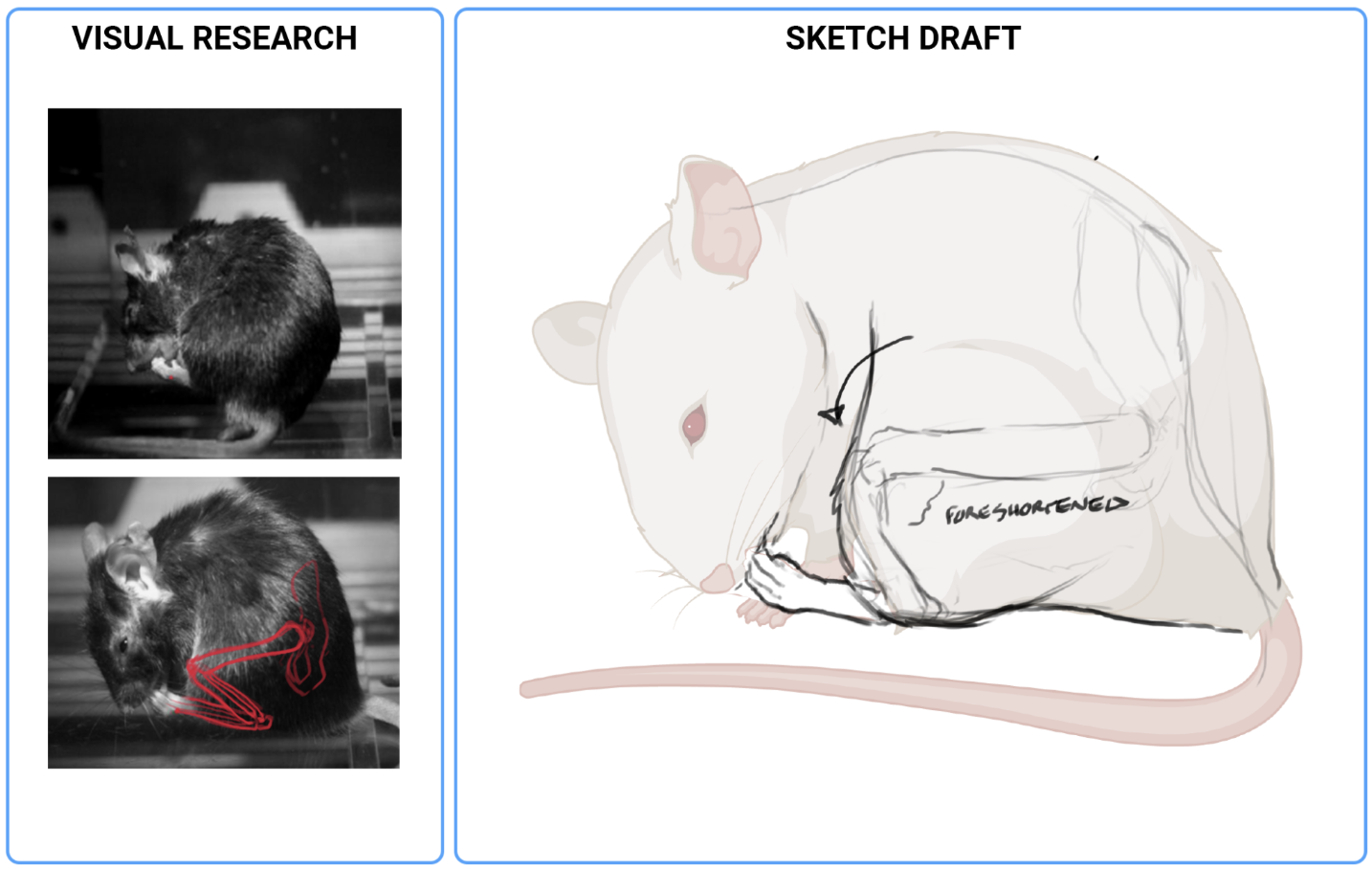
With the need identified, the illustrator builds a research board: gathering references from anatomical sources and published literature, pulling related existing icons to anchor the new one in a consistent visual language, and then determining how to represent each feature accurately.
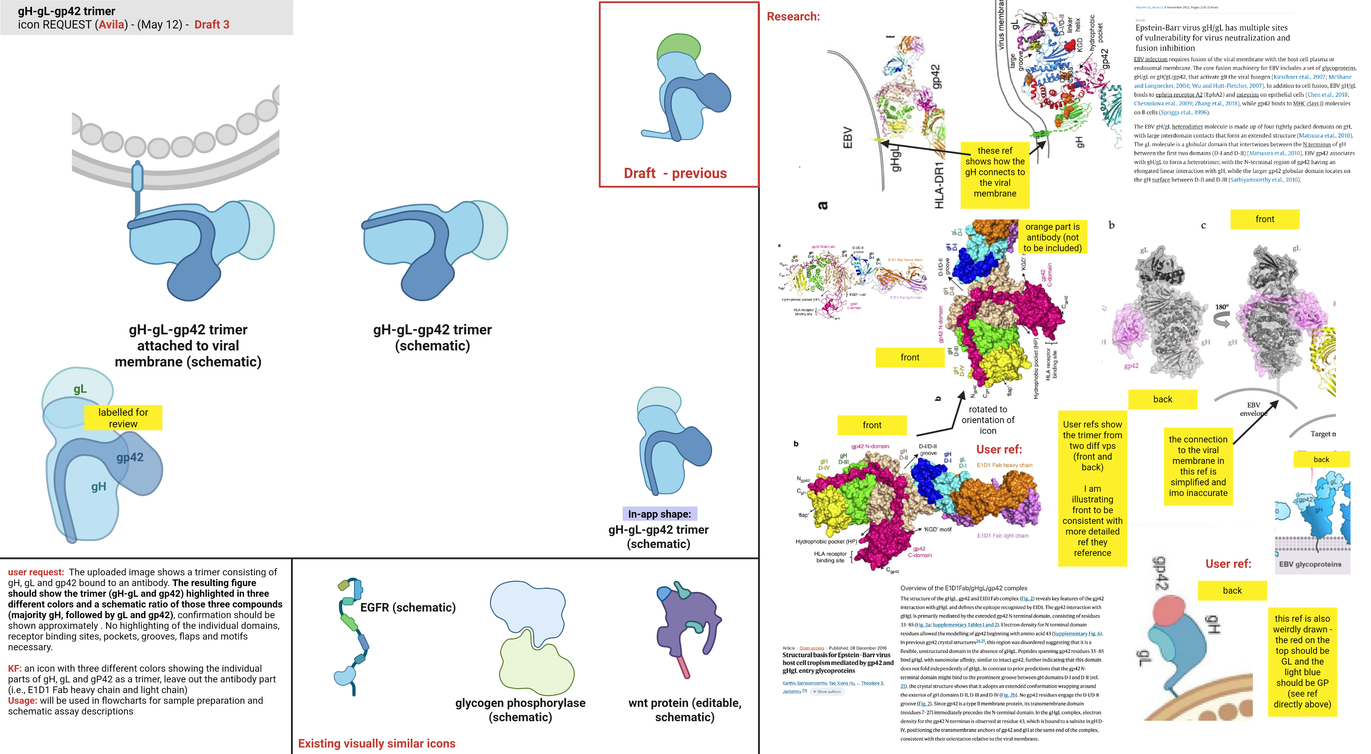
With the references in hand, the illustrator produces a rough sketch to lock in the key features and overall composition before any detailed work begins.

The sketch and its research board go to a paired peer reviewer, whose job is to catch major content or style issues before any vector work starts. As in published science, nothing at BioRender advances on one person's judgment alone.
The icon is built as clean vector art, crisp lines, flat fills, and a standardized palette, with precise layering. That layering is what later lets you recolor and edit the icon inside BioRender.

The BioRender team reviews the icon against a fixed set of questions: are all key features present and clearly defined, is it distinctive and recognizable, were the right references applied, and does the rendering match BioRender's style? Icons are checked at high-magnification for detail and at the actual size they'll appear in-app, and most go through two rounds.

A senior BioRender illustrator gives the final approval. If a researcher requested the icon, we send them a preview before publishing. This confirms we’ve built exactly what they requested and, for niche topics, provides an added layer of expert review.
After the icon is approved and before BioRender publishes it, the illustrator builds custom color presets, lighter, darker, differently saturated, or tuned to natural variation, anticipating how you'll use the icon in a figure.

Publishing is the start of an icon's life, but not the end of our responsibility for it. BioRender runs an active bug-reporting process, and if an icon is found to be inaccurate, our illustrators return to the research and correct it, with the team reviewing the update. We also lean on our community of more than 4 million scientists, and subject-matter experts in each field, to keep icons accurate as the science evolves.
Our zebrafish brain icons are one example. Not long after we published them, a zebrafish researcher wrote in with a detailed critique, backed by his own published work around dissections of fixed fish brains and MRI images of living fish. Measured against the real anatomy, our icons were off. The brains were the wrong color: pink, when a fixed brain is ivory-white, slightly yellow from its high lipid content. The olfactory bulbs pointed forward instead of down toward the nose, the telencephalon was too small, and the cerebellum sat too low.
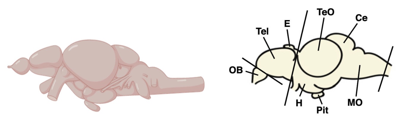
Our illustrators took his references back to the research team and reworked the icons, trading previews with him until he signed off on the anatomy. Then we republished them.

"I am happy to see that BioRender appreciates feedback. That's how we improve the world. when people publish images of brains that show the correct anatomy, we are one step closer to better understanding the brain."
The next time you drop an icon into a figure, it's worth remembering the people and process behind it. A medical illustrator researched the structure, sketched it, sent it through peer review, built it line-by-line, and put their name to it. A PhD scientist in the field checked that it was right. If the science evolves, someone returns to it and corrects it. Their work is reinforced by the millions of researchers who use BioRender and flag anything that looks off, along with the subject-matter experts and institutions we collaborate with on specialized content. You can trace every element of a BioRender icon back to a source, a decision, and a person who put real thought and care into getting it right.
My background in neuroscience taught me that there's no better way to understand tough science than an accurate, beautiful illustration. So when I make an icon, accuracy is the first thing on my mind. From the research through the rounds of review, I want to be sure scientists can trust my icons to communicate their work with confidence.
- Avila Sanchez, Medical Illustrator at BioRender
BioRender icons are designed to meet the high standards of scientific publishing and grant funding. Learn more about journal and grant funder policies.


